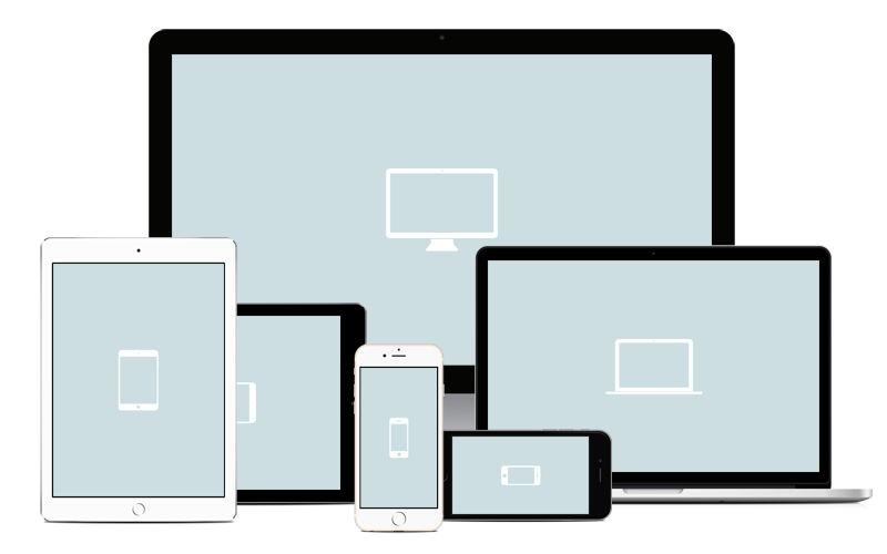
Responsive web design (RWD) is a web design approach aimed at crafting sites to provide an optimal viewing experience—easy reading and navigation with a minimum of resizing, panning, and scrolling—across a wide range of devices Responsive web design is a web development approach that creates dynamic changes to the appearance of a website, depending on the screen size and orientation of the device being used to view it. a responsive website may appear one way on a laptop, another way on a tablet, and still another way on smartphone.
Media queries, a feature of cascading style sheets (CSS), allow the developer to specify when a certain style takes effect. With CSS2, for example, a media query will serve printer-friendly style sheets if requested. CSS3 has expanded query capabilities that allow style sheets to be targeted to a device’s display and serve a desktop, tablet or smartphone style sheet depending on the query response.
Bootstrap Services
Bootstrap is the fantastic responsive front-end frame work to develop web applications and it is grid system.Bootstrap developing websites and custom applications that are cross-browser and cross-device compatible (responsive).
We offer Bootstrap Web development Services that fits any type of mobile devices ,desktops , Laptops and Tablets.It Easily convert PSD to HTML or any Dynamic websites and that can be easily operated from any device's.
- Bootstrap Web Applications fit all screens.
- Less time to take development web application.
- All Browsers & Device Support